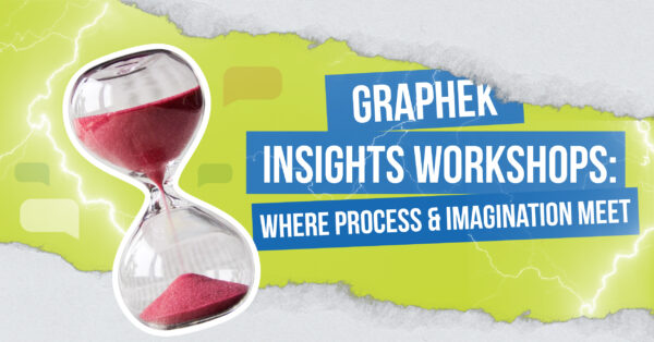
While the logos and brands we create may be our most front-facing work, just as much of our time is spent behind the scenes, working with clients through every decision pain-point. One our most successful – and enjoyable! – methods for gaining the intel we need and helping our clients through the process is our Creative Insights Workshop. Designed to serve as a catalyst for imagination, the workshops are essentially a series of stepping stones designed to evoke emotion, humanize and lend personality to a brand, and encourage decision-makers to listen to each other and paint a picture together of how they want their logo or brand to come to life.
An almost-universally loved part of these workshops is what we call the lightning round, when we present a wide range of moods, colors, feelings, and ideas and ask clients to quickly respond – do they love it? Hate it? Somewhere in between? The speed with which we go through the rounds often provides us with their unfiltered reactions, which is enormously useful to us as we seek to define how a brand or logo should represent the organization.
“I love finding ‘Easter egg’ information from a client,” said Jay Woods, our designer and motion artist. “Even the smallest thing they can tell us about who they are and what they stand for can result in something that I can sneak into the concept of a logo or the personality of a brand. The lightning round and workshop give us direction; if we know if an organization wants a friendly or serious vibe, that will weave through the concept decisions we make.”
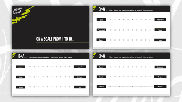
Our workshops also drill into specifics, including, for example, colors: If a client says it has to include red, do they mean firetruck red, or a dark maroon? Everything has very specific connotations and vibes, and our workshops draw those details out.
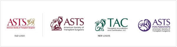
“In redesigning a logo for the American Society of Transplant Surgeons (ASTS), we learned the importance of the Chimera – a Greek mythological creature with the head and front legs of a lion, the head and back legs of a goat, and the head of a snake for a tail,” Woods added. “The core issue ASTS had with their old logo was the lack of detail and clarity of the Chimera, and they wanted to move away from an ‘old boys network’ feeling and seem more inviting.”
“Overall, our goal is for clients to feel heard through these workshops,” they added. “We do our research and ask a lot of thought-provoking questions. We want clients to feel challenged, but we also want it to be fun. At the end, we want our clients to feel confident that we ‘get’ them and that we’re going to nail it, which we usually do.”
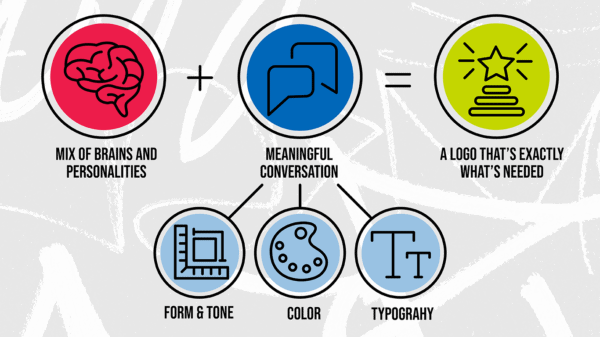
Erik Schonher, ASTS’ director of strategy and innovation, along with Diane Mossholder, COO, and Anna Shults, marketing communications specialist, remember the process as a true team effort, requiring a curated mix of brains and personalities to get it right.
“We cast a wide net initially,” Schonher said. “Transplant surgeons have notoriously difficult schedules, so we included our entire council and foundation board, from committees and trainee advisory groups. We sought to represent a healthy slice of the leadership.”
“The workshop and meetings with GRAPHEK were really exciting and fun,” added Mossholder. “This was my first time doing anything like this, and it was helpful for me to understand the process and our next steps. We wanted high-level project management in addition to the actual design piece of it, and we got that with GRAPHEK.”
The process also helped the team truly understand how meaningful the Chimera is to their members and how attached they are to it.
“I thought I knew our members well,” Mossholder said, “but all these years later, I still learned some things, which was really enjoyable. We knew the Chimera had to stay, but the workshop helped uncover how deeply its symbolism runs in our members. I feel as though our members don’t talk about their emotions much, since they work in such intense situations, so to hear them get emotional about whether the Chimera should be proud or fierce was a real treat for us and gave us so much insight into how they view themselves. Better understanding our members’ identity was a huge benefit of this workshop, beyond the obvious resulting logo.”
“If there is a lesson to come out of the workshop for associations,” Schonher agreed, “I’d also say that the process helps reveal members’ identity. Some associations may not necessarily respect their logo, but we realized our members identify so strongly with ours, it’s become part of who they are. We loved hearing how our members feel about the logo; they were so invested in the process.”
Shults found the process equally engaging, discovering in the process that one of her biggest take-aways was that the end result was even better than they’d dared to imagine.
“I feel like GRAPHEK somehow understood the vision better than we did. Seeing it materialize was an incredible feeling; I didn’t fully realize beforehand exactly what we wanted, but it’s exactly what we needed.”